Get this:
For every post you publish, there are probably a million similar articles already on the web.

The good news is, the vast majority of posts online aren’t that great.
If you want to cut through the noise, you need to consistently create content that’s a cut above the rest.
Incorporating visual content into your blog posts is a surefire way to do this.
Allow me to show you how.
Table Of Contents
Why use visual content in your blog?
There are several reasons why solo bloggers need to start using visuals.
Let me give you a quick demonstration:

Here’s the thing: 43 percent of readers skim blog posts.
Without eye-catching details, like subheadings and the image above, they may prematurely decide to leave your post.
Still not convinced that you need a visual content strategy?
Apart from grabbing the attention of readers, here are a few more reasons why your blog needs visuals:
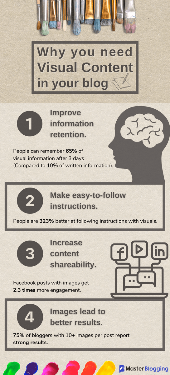
Facts and statistics are cool, but they’re not really fun to look at.
So, let me try that again:
Ready to take your blog content strategy to a whole new level?
A lot of small bloggers are probably worrying about the costs of creating visuals for their content.
Sure, hiring an experienced graphic designer to lead your visual content development will probably lead to the best results. But if money’s a little tight, there are plenty of visual content ideas that don’t require professional hands.
Visual content ideas you can create today
Before we get to the good stuff, let me tell you something using visuals in your blog.
Visual content, be it an infographic, video, or screenshot, contributes to the size of a web page.
Without a proper optimization strategy in place, visuals can severely affect your website’s performance.
That’s why I use ShortPixel to automatically optimize my images as I work.
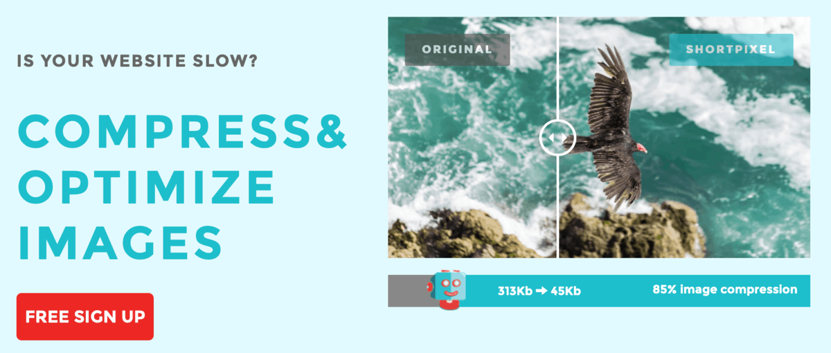
ShortPixel works by automatically compressing image files as soon as you upload them to your WordPress media library. It also features bulk optimization, image format conversion, and multiple compression methods, including lossy, glossy, and lossless.
For more ways to increase your website’s loading speed, check out this post.
Without further ado, here are the visual content ideas you can use to spice up your blog content today:
1. Annotated screenshots
Do you write a lot of software reviews or tutorials on your blog?
How about website roundups or reaction posts?
If you answered yes to any of the above, you’ve probably used screenshots before.
You know – something like this:

There are a couple of easy ways to take screenshots on your computer. In fact, I’m pretty confident you already know how to take a screenshot without using anything fancy.
What a lot of bloggers don’t know, however, is how to take an annotated screenshot.
In case you didn’t know, annotations are extra bits of information added on top of an existing document or image. It can be an arrow, shape, text, or anything that adds context to the file.
Here’s an example:
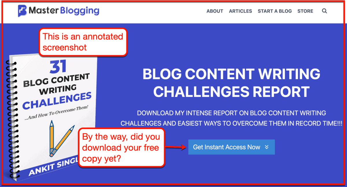
Looks a lot better, huh?
Annotations make screenshots significantly more effective in making your point. They also allow you to better communicate instructions with your audience.
How to create annotated screenshots
Before considering paid options, remember that there are free screenshot tools with annotation features for both macOS and Windows.
Jing by TechSmith is great for Windows users whereas Skitch is a solid choice for macOs users.
Here’s a fun fact: Neil Patel actually used Skitch to take screenshots for his blog.
Anyone can easily confirm this because he sticked with the default annotations style.

My screenshot tool of choice, however, would be Snagit.
It’s an all-in-one screenshot software with advanced features like panoramic capture, animated GIF creator, blur tool, and more.
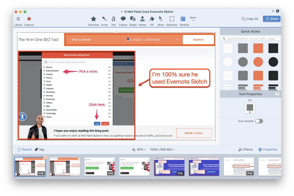
You can go with any screenshot tool that suits you. The important thing is you can add annotations that instill your blogging voice into every screenshot you capture.
2. Memes
Remember the image I used earlier?
That’s what you call a meme.
And yes – many brands use them to make their content more engaging, especially when promoting on social media.
Here’s an example from HostGator:

A simple way to use memes is to emphasize a relatable emotion or situation that your audience is familiar with. You can then embed it in a relevant post as a way to hook readers.
It’s only a matter of finding a meme template that matches what you’re trying to convey.
For example, if you want to create a meme about accomplishing something important, you can use the “Happy Picard” meme.

How to create memes
You can technically create a meme using any graphic design software out there – free or paid.
My go-to option, however, is to use a proper tool like Meme Generator by Imgflip.
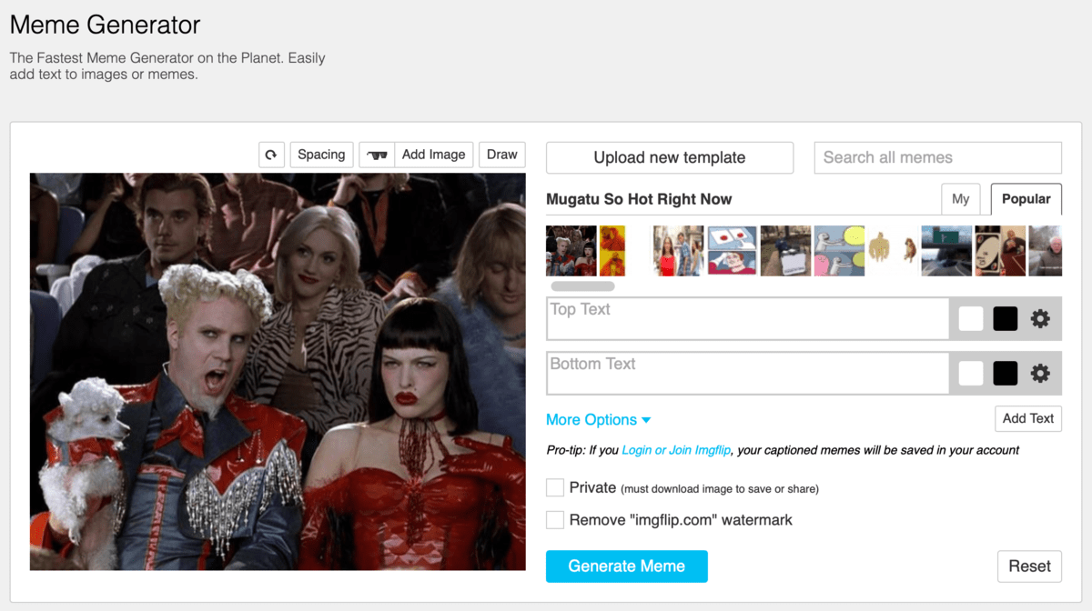
What makes Meme Generator so brilliant is that you can easily search for popular templates that the online crowd knows.
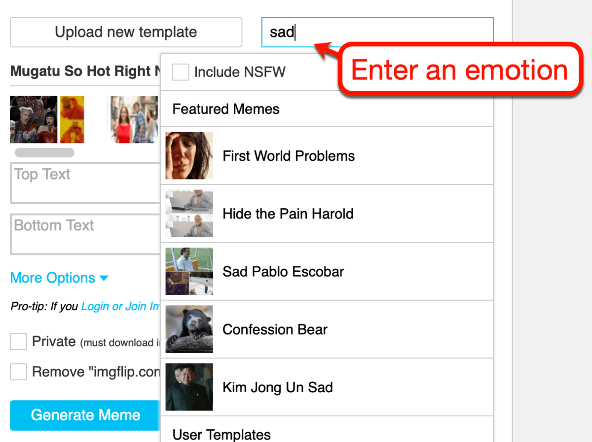
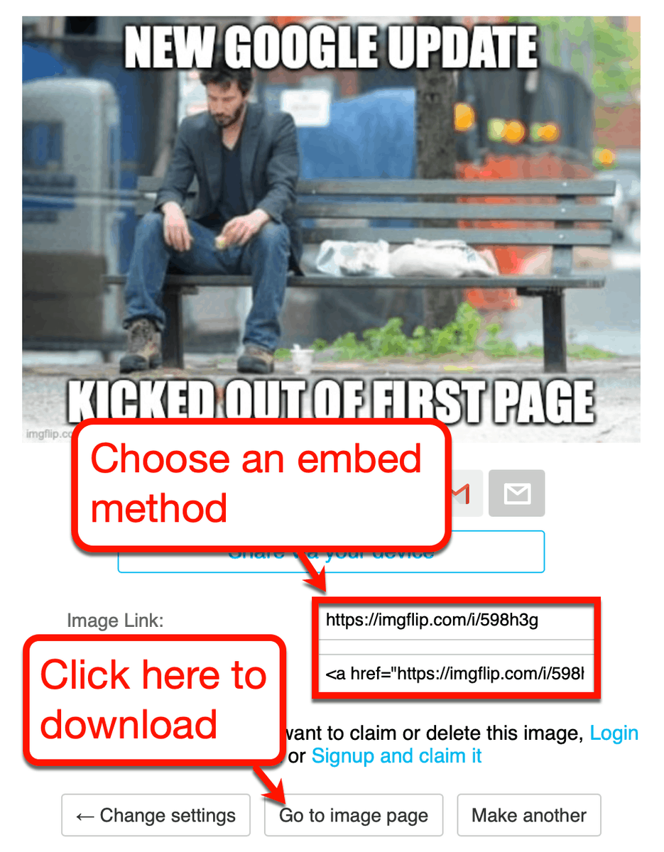
Let’s say you want to create a meme about getting a Google penalty.
Ask yourself, what emotion would you feel if your website is suddenly booted off Google’s first page?
Just plug that into the search bar to see potential templates.
The next step is to write original captions to make your meme unique.
Usually, memes have text at the top and bottom of the image. Just type in the captions you want to use and check the live preview to see if it looks good.
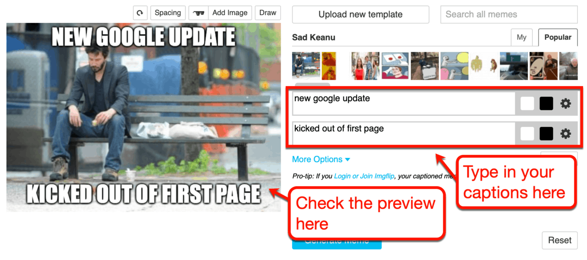
If you’re happy with your meme, click ‘Generate Meme.’
You can then choose to embed your meme via a direct link or HTML code. Alternatively, you can click ‘Go to image page’ to download a copy of your meme.
I prefer the latter option since it makes it easier to reuse the meme.
3. Animated GIFs
Speaking of memes, an animated GIF is another popular meme format.
You typically find them in the comments section of social media posts. Of course, you can also use them in your blog posts to convey relatable emotions or situations.

In some cases, you can also use animated GIFs to relay instructions that involve multiple steps or screens.
I’ve done this on a couple of occasions when writing some of my in-depth articles.
Here’s an example of an animated GIF I created to walk readers through the SpyFu interface:

Imagine showing readers the sections of SpyFu using static images.
With an animated GIF, I can show readers visual information that would’ve taken five or more images.
You can do the same with the right tools.
How to create animated GIFs
If your goal is to create an animated GIF meme, you can use a website like GIPHY to get it done.
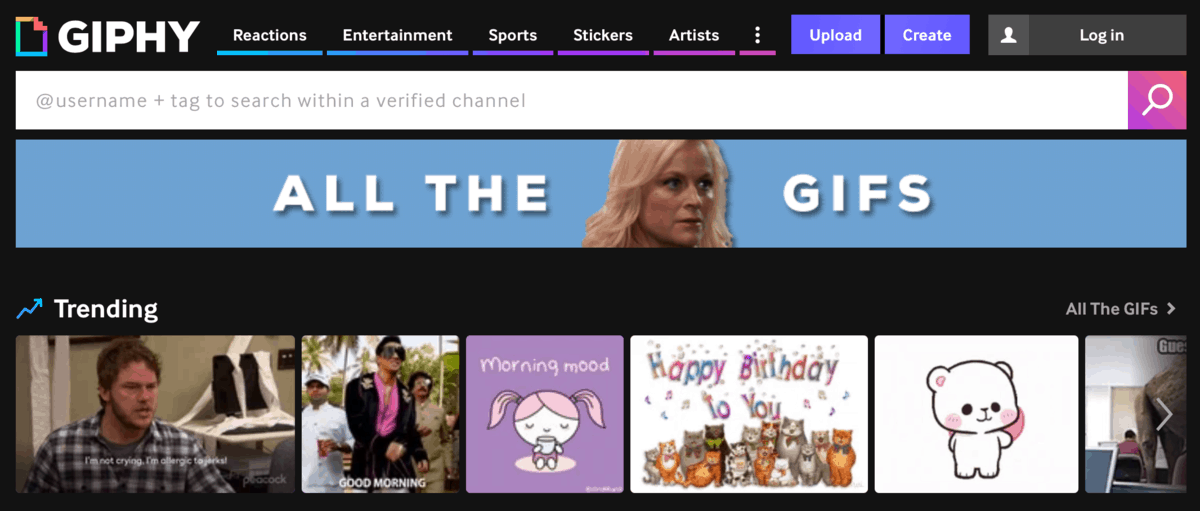
GIPHY offers a collection of ready-to-use GIFs from movie clips, news stories, social media posts, and independent animators.
Regardless of the type of animation you use, rest assured that you don’t have to pay a single cent.
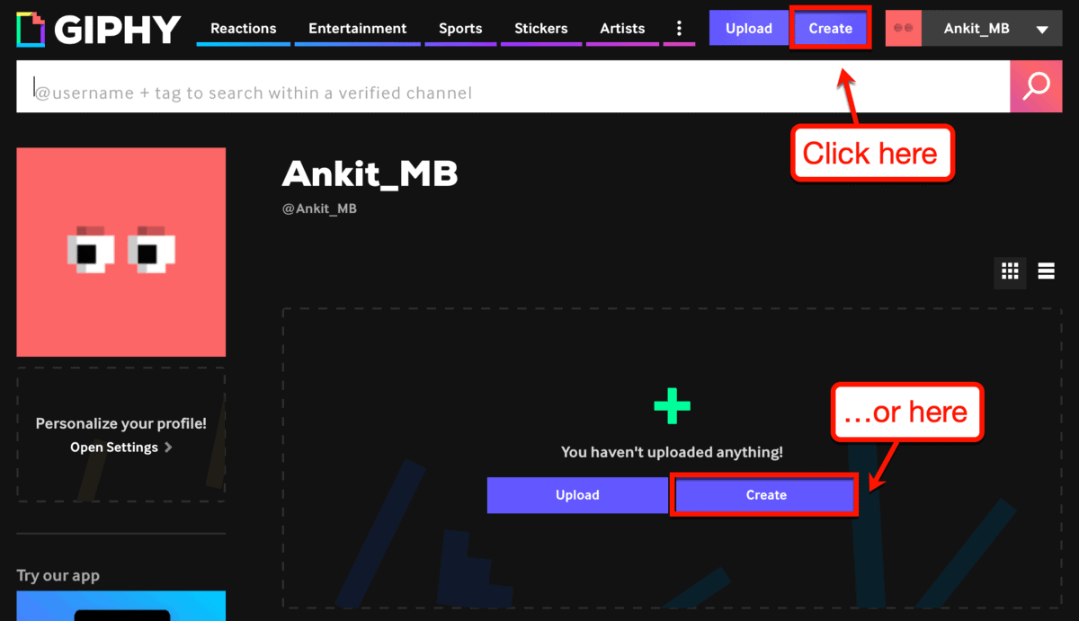
If you want to create your own GIF, the first step is to create an account. Once you’re in, click the ‘Create’ button from the top bar or from your GIPHY profile.
When creating animated GIFs with GIF, you can start with an existing animation or sticker. If you don’t have any of those, you can use a media URL from platforms like YouTube and Vimeo.
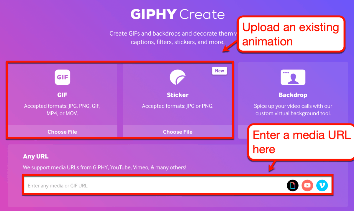
To use a media URL, be sure the video you want to use is less than 100 MB in size. It must also be shorter than 10 minutes.
For the sake of this post, let’s try to create a GIF using one of my YouTube videos.
After entering its URL, GIPHY will take you to the trimming tool.
Here, all you have to do is specify the duration and start time of your GIF.

From there, click ‘Continue to Decorate’ to start writing a caption for your animated GIF.
Feel free to explore the available styles, stickers, text animations, and filters to make your GIF extra spicy.
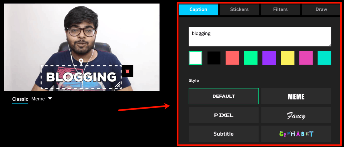
Finally, it’s time to finalize the details of your animated GIF.
On the “Add Info” page, you can specify your GIF’s source URL, tags, and visibility.

Adding a source URL helps GIPHY users find the original source of your GIF. If you use your own media, this could bring traffic to either your blog or the website that hosts it.
As for the tags, use anything that can help the right people find your GIF. You can then leave the visibility option as is to make sure people can discover your work.
Click ‘Upload to GIPHY’ to complete the GIF creation process. Within seconds, GIPHY should automatically take you to your freshly made animated GIF page.
You may start sharing your GIF via a link, embed code, or social sharing button. If you want, you can download your GIF using your browser’s context menu.
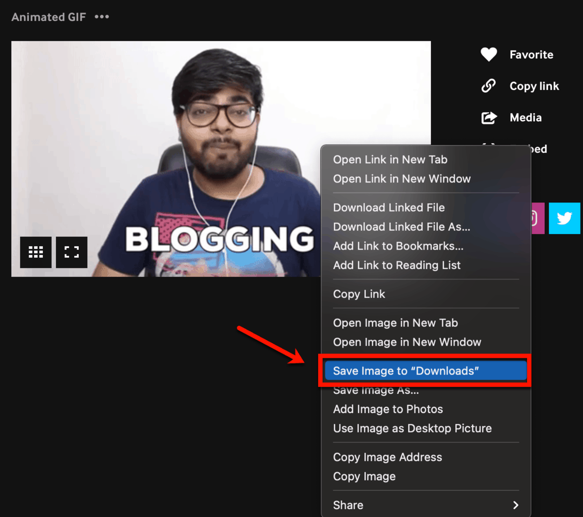
In case you’re curious, here’s the finished product:

Aside from memes, animated GIFs are also useful in sharing instructions with your audience.
There are lots of tools out there that can help you use screen recordings to create animated GIFs. My personal tool of choice, however, is Snagit with its screen video capture tool.
To use it, select ‘Video’ from the capture window or the “OneClick” tab.

Next, click and drag to select the area of the screen you want to capture.
Suppose you want to record your browser as you scroll through your homepage.
Simply drag a box around your browser’s main window and click the red ‘Record’ button to start.

To end a recording, click the blue ‘Stop’ button.
Don’t worry about getting everything right during the recording process. You can still preview and trim your work from Snagit’s main editor.
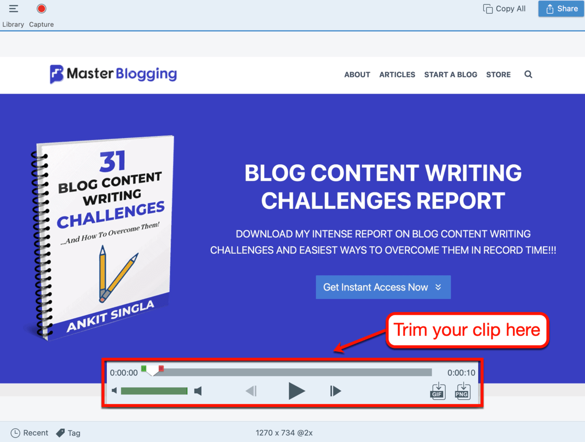
To turn the clip into an animated GIF, click the ‘GIF’ icon just below the video scrub bar. That’s the slider that you use to jump to specific parts of a video.

You can then configure your GIF’s optimization, frame rate, dimensions, and effects.
To keep your GIF smooth and crystal clear, use the settings below. As for effects like dithering, dynamic colors, and looping, use your own discretion.
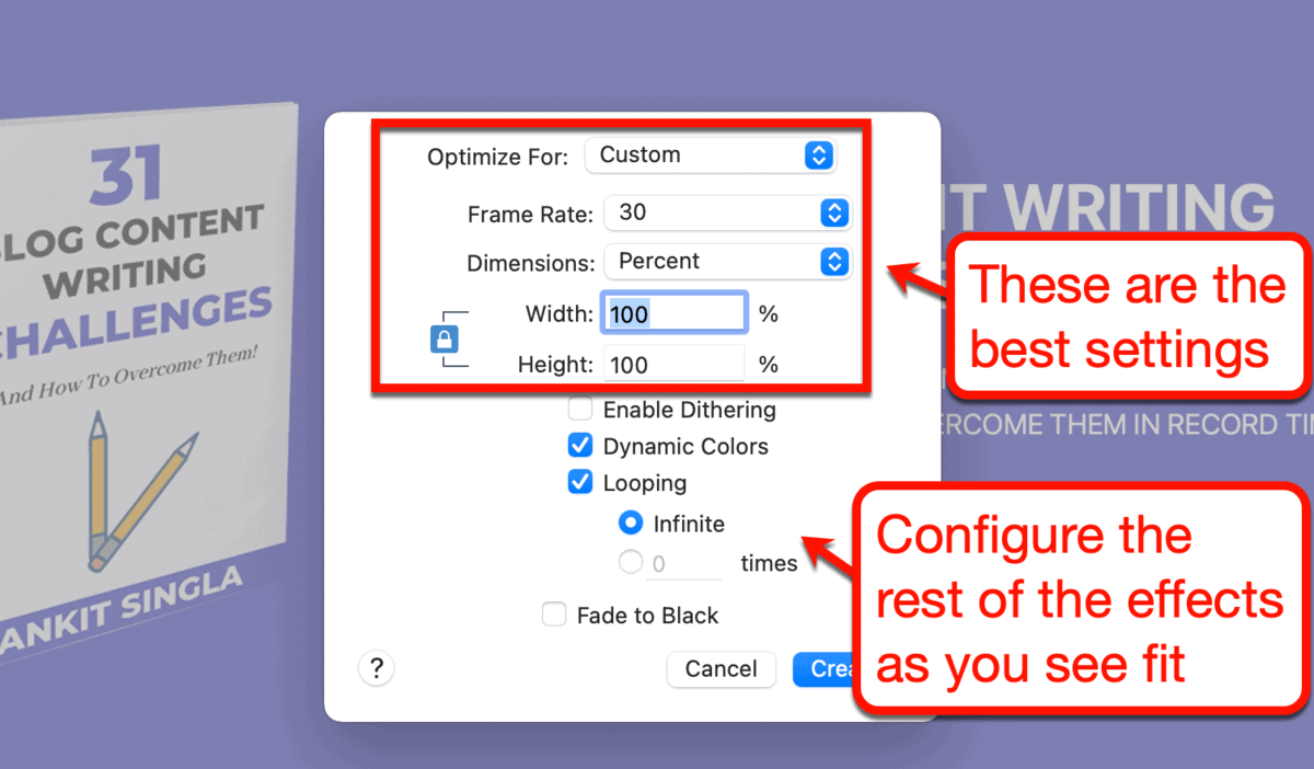
If you plan to use a lot of GIFs in your content, consider reducing each clip’s frame rate and dimensions.
Animated GIFs can be quite big in terms of file size. As such, be prepared to reduce their quality in order to preserve your website’s performance.
When you’re done, click ‘Create’ to save your animated GIF.

Remember, using screen recordings to create animated GIFs can help you build engaging, detailed tutorials. You can show readers what to do and exactly how to do it – without having to rely on videos.
4. Visual charts
Want to show readers an interesting piece of statistical data?
Don’t just write it – visualize it.
Creating data visualizations is one of the things that helped me hone my visual content creation skills over the years. And, for most data sets, a chart is the most effective visual communication tool.
For example, you may have seen the image below a couple of times in this blog.

It’s a simple graph that visualizes the abandonment rate of mobile and desktop users after three seconds.
I know – it’s not really that awesome. But it’s much more interesting and eye-catching than writing this:
- 53 percent of mobile users leave a site if it doesn’t load in three seconds
- 40 percent of desktop users leave a site if it doesn’t load in three seconds
How to create charts
So far, we’ve covered four different types of visuals and a handful of tools you can use to create them.
I think it’s a good time to introduce you to my favorite graphic design tool for beginners.
With a drag-and-drop tool like Canva, you can easily put together a chart in minutes.

In my experience, Canva is one of the best data visualization tools for beginners. You don’t even have to pay for it to enjoy all the core graphic design features.
Just create a free account and click ‘Create a design’ to get started. Alternatively, you can browse the categories under “Design anything” to get template suggestions tailored to your needs.
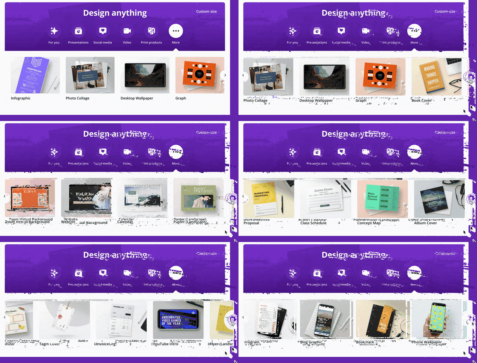
If you want to create a chart, select the ‘Graph’ category.
The Canva editor will then immediately provide you with templates you can build on.
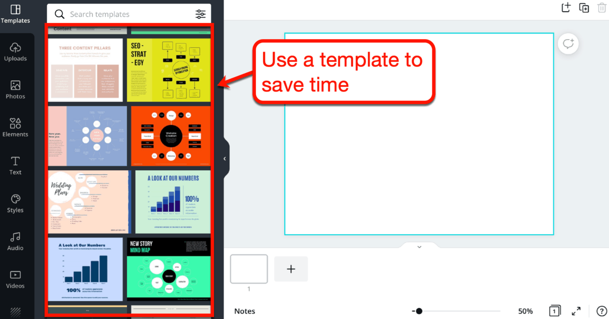
Keep in mind that the template you choose doesn’t have to perfectly match your brand’s colors and visual style.
Aspects like fonts, colors, and the position of elements are fully customizable within the drag-and-drop editor.
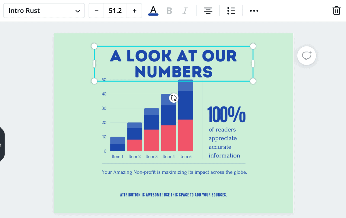
That looks cool and all.
But what about the data?
Luckily, Canva included an ‘Edit’ button that allows you to simply punch in the numbers you want to present. To save even more time, you can also paste data directly from a spreadsheet.
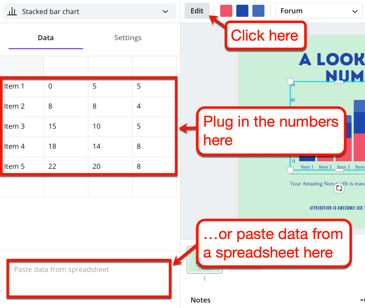
To see the other types of charts you can create with Canva, expand the drop-down menu above the ‘Data’ tab.
Here’s a quick rundown of the chart formats you can use:
- Bar chart
- Stacked bar chart
- Row chart
- Stacked row chart
- Line chart
- Area chart
- Scatterplot chart
- Histogram chart
- Pie chart
- Donut chart

Since we’re using Canva, don’t forget that everything in your design can be moved, resized, or deleted.
If you’re feeling extra creative, don’t hesitate to decorate your chart with vector graphics and text.
Canva has a massive library of assets you can use to level up your design. You can even search for stock photos you can include to give your visual more “oomph.”
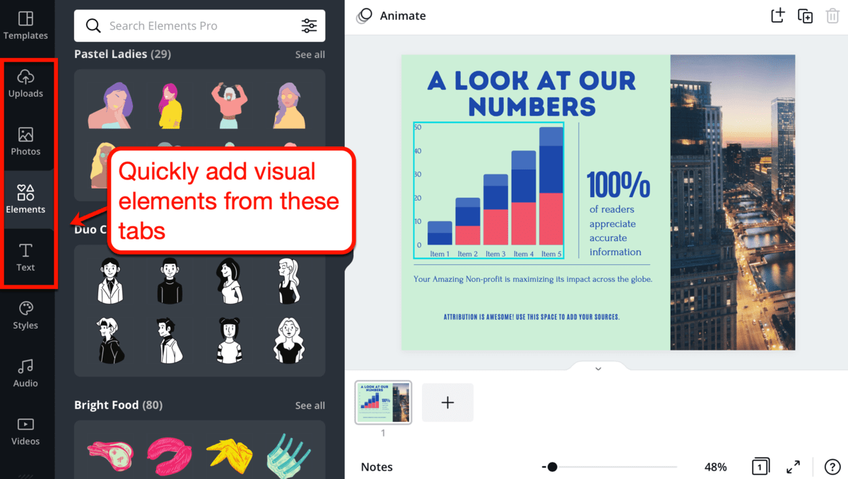
Looks fun, right?
You may also notice that there are tabs called ‘Audio’ and ‘Videos’ at the bottom of the pile.
Since they don’t really make sense to include in a chart, we’ll get to them later.
5. Visualized facts
Remember that a chart is only one of the many types of data visualizations you can use in your blog.
You will learn about most of them when we talk about infographics in the next section.
For now, let’s try something easy.
A visualized fact is, to put it simply, just a fancier factual statement.
Here’s a fact:
Ankit Singla spends an average of 5-8 hours a day writing blog content.
Now, here’s a visualized fact:

See the difference?
A visualized fact takes advantage of fonts, colors, and imagery to emphasize something.
Certain concepts are also much easier to explain using a visualization.
For example, I’m fairly proud of my “Ikigai” visualization.
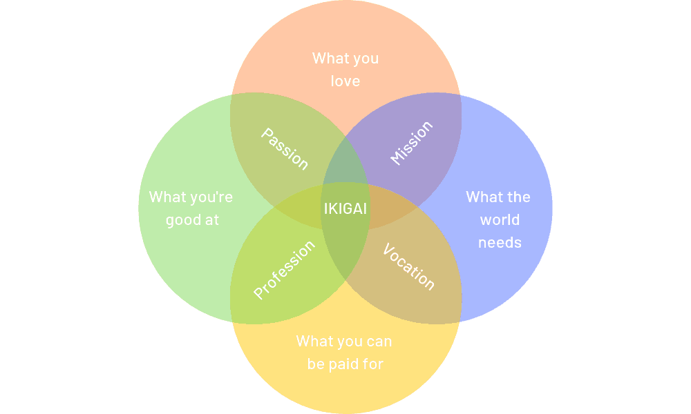
Ikigai is the convergence of the following:
- What you love
- What you’re good at
- What the world needs
- What you can charge for
It’s also the point where your passion, personal mission, profession, and vocation meet.
The visual above makes Ikigai significantly easier to understand by people who’ve never heard of it before. So, if you ever have to explain something profound or too technical, consider creating a unique visual for it.
How to create visualized facts
Full disclosure: I used Canva for both of the visualizations above.
You can get the same results by playing with different color combinations, shapes, transparency, and text effects.
If you want ideas on how to visualize certain facts, my advice is to do a Google image search.
For example, I searched for “difference between concave and convex mirrors.”
Here’s the first post from the regular search results:
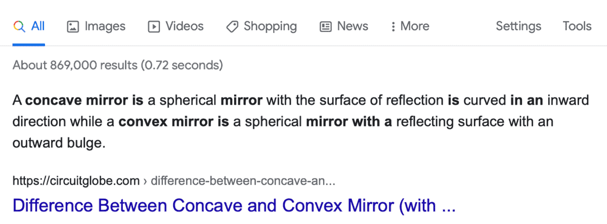
Got a good look at the explanation above?
Next up, here’s a visual explanation from Google images – courtesy of Key Differences:
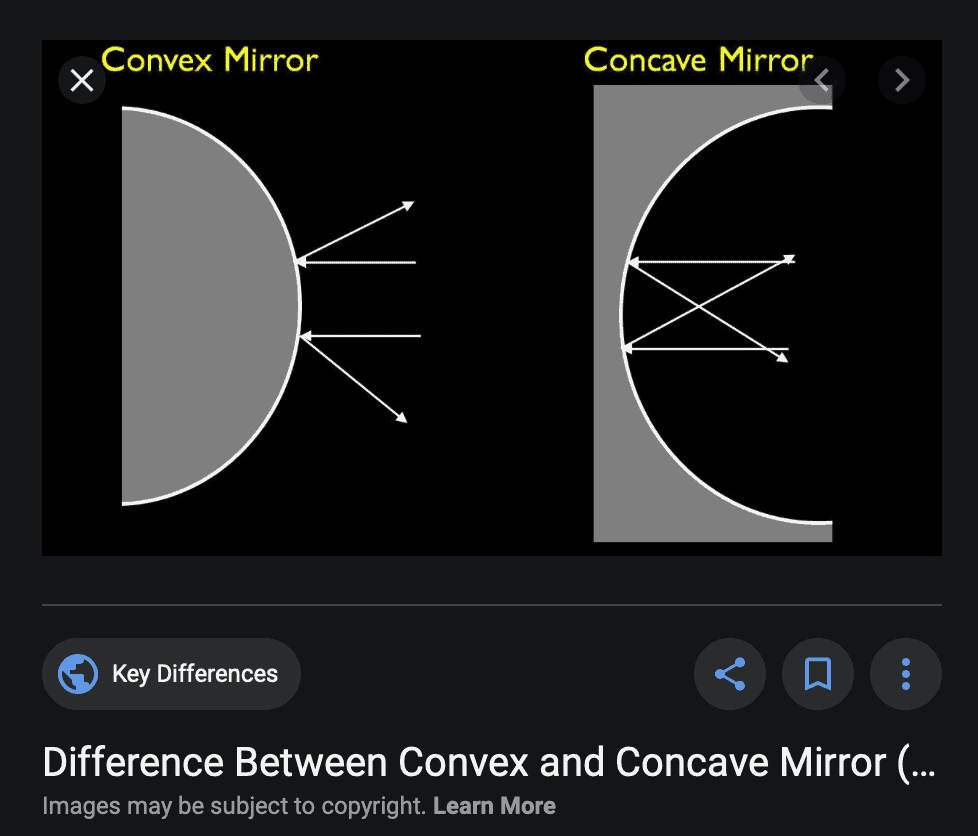
You don’t have to be a rocket scientist to know that the visualized fact offered a clearer explanation.
6. Infographics
Let’s get one thing straight:
A data visualization is a simple, visual representation of a single piece or set of information.
An infographic, however, may include several pieces of data visualizations.
It’s a longer, more comprehensive piece of content that packages visual content with other elements, like:
- Storytelling
- Related facts
- Decorative graphics
If I were to define what an infographic is, I’d say this:
It’s a content piece that relies on text just as much as it relies on visuals.
Check out this example from one of my favorite social media marketing blogs of all time, Social Media Examiner:

As you can see, the infographic above provides enough context on key visualizations it contains.
It does this using text and a logical structure that ensures an engaging learning experience for users.
How to create infographics
You guessed it – Canva also has the templates and tools that can help non-designers build infographics from scratch.
The tool offers dozens of professionally designed infographic templates to speed up the design process.

Again, don’t pay too much attention to a template’s colors and fonts.
Every single detail of an infographic template can be easily customized via Canva’s drag-and-drop editor.
With a little practice, you can also design an original infographic from scratch.
Canva has more than enough shapes, clip arts, typography options, and charts to last you for days.
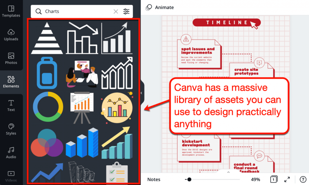
Alright – I may be focusing too much on Canva in this post.
After all, there are several drag-and-drop graphic design tools out there with comparable capabilities.
I’ll let you pick something out from this list of image editing tools for bloggers.
Here are a few recommendations:
- If you want a beginner-friendly tool for custom vector graphics, try Vectr
- For infographics filled with data, consider Venngage or Piktochart
- If your goal is to create shareworthy images, use PicMonkey
- For a little bit of everything and a decent free plan, stick with Canva
7. Heading graphics
Get that generic stock photo out of here.
I get it – royalty-free images from websites like Pixabay and Pexels are convenient. But if you’re serious about blogging, you know that your audience deserves better.
Custom heading graphics are great if you’re struggling to look for ways to use visuals.
I, for one, use them regularly when writing quick lists within my posts.
For instance, take a look at the graphics I used in my social proof guide:
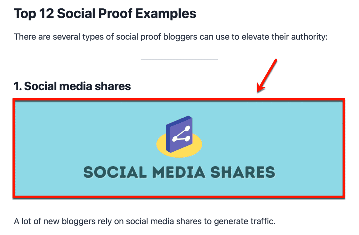
Bear in mind that you can always add more information to subheading graphics. Do this to let your audience know what to expect from a section – helpful if they’re skimming your post.
A great example would be the subheading graphics I used for my article on blog post structures.
Take a gander:

This way, your subheading graphics will be more than just pure decorations. They also become important elements of your post that provide readers with a more engaging and compelling learning experience.
How to create header graphics
If you look closely, you’ll notice that I use the same font styles in my graphics in the past months.
That’s because I use the same tool for all of them.
And yes – that tool is still Canva.
What can I say? Creating graphics with their intuitive drag-and-drop interface is such a breeze.
You can also upload local image files, which is useful if you want to add screenshots to the mix.

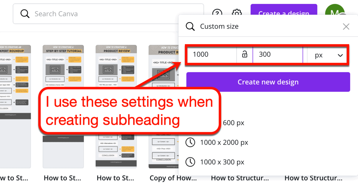
To create a subheading graphic from scratch, click ‘Create a design’ and choose ‘Blog Banner.’ As an alternative, create a custom, landscape design to keep your banner short and wide.

Personally, I use a custom size with a width of 1,000 pixels and a height of 300 pixels.
It’s the size I use whenever I create subheading images that are only meant to capture the audience’s attention.
Here’s another tip: compose the basic style you want to use first.
If you want to create multiple subheading graphics for one list, duplicate the first page as many times as necessary. This essentially allows you to use your first design as a template for the rest of the subheading graphics.
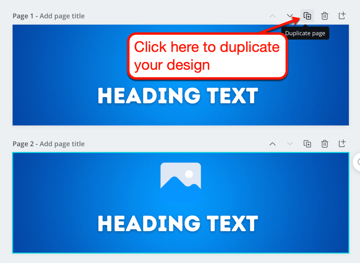
That’s about it.
You can now easily create multiple subheading images using the same style – perfect if you’re writing a long listicle.
8. Image quotes
If you’re a long-time reader, you’ll know that I sometimes include tweetable quotes whenever I come up with “truth bombs.”
Here’s a live demonstration for you:
Using tweetable quotes allows you to leverage the power of social sharing to grow your brand’s online reach.
The problem is, it’s only good if your readers like to share content on Twitter.
To encourage them to share your quote elsewhere, you should try creating image quotes instead.

Of course, you don’t have to come up with your own quote for this.
Bloggers quote other people all the time. Just be sure you give credit to whom credit is due.
How to create image quotes
The first thing you should do is find an actual shareable quote that relates to your message.
With websites like BrainyQuote, great quotes are only a search bar away.

To keep things relevant, let’s look for quotes related to blogging.
Using the keyword “blogging,” BrainyQuote provided me with this gem:

Nice.
Let’s then take this quote and plug it into our favorite tool.
On Canva, there are a few design templates you can use to create image quotes.

Since image quotes are popular on Instagram, let’s go with a 1×1 template like ‘Motivational Quote Social Graphic.’
Upon selection, Canva will present you with truckloads of templates you can work with.
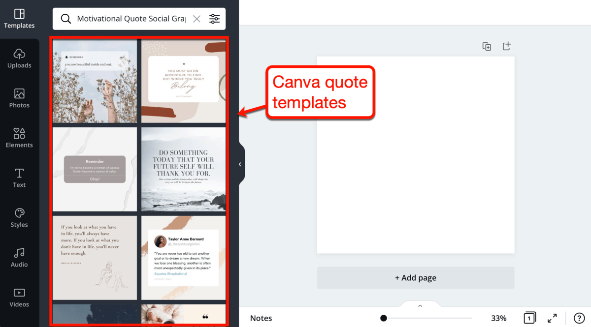
Always remember that you’re always free to build your design from a blank canvas.
But if you want the quickest way to produce professional-looking graphics, just pick a template and customize it.
The template below, in particular, resembles a quote taken right out of Twitter.
I recommend using it if you’re quoting someone’s tweet. If not, you can still type in their Twitter handle to make the quote more authentic.

Want to know how to make your image quote more awesome?
We can turn it into an animated GIF.
Canva features 13 element animation types that will allow your graphic to turn even more heads.
Simply click the ‘Animate’ button and pick one that piques your interest.
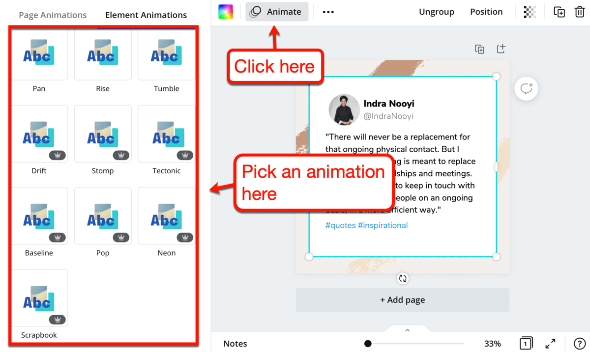
After selecting an animation style, click ‘Download’ and select ‘GIF’ from the drop-down menu. This will allow you to save your work as an animated GIF.

To show you what an animated graphic from Canva looks like, here’s the image quote I just created:
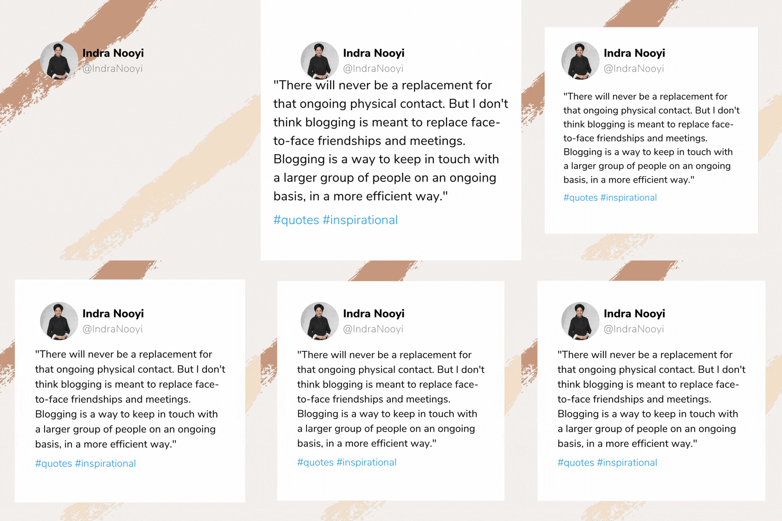
By default, animated designs from Canva are looping. This means the animation repeats as long as it’s loaded – be it on a web page or word processing app.
To disable this feature, you need an app that can edit GIF files, like Snagit.
Simply launch the tool, open your animated GIF, and export the file while unchecking the ‘Looping’ option.

9. Videos
You knew this was coming.
The top bloggers in the most competitive industries utilize video content to stand out from the rest of the pack.
Nearly all of the top bloggers I follow in the marketing niche, including Brian Dean and Neil Patel, use videos. If you want to replicate their success, you should be willing to take the steps that they took.
I realized this a couple of years ago – compelling me to start my very own YouTube channel.

It’s definitely far from what I’d call a “successful channel,” but I do plan on getting there. But due to the global pandemic, I’m currently focusing on what I do best – creating blog content.
How to create videos
For starters, I don’t recommend jumping into YouTube marketing right away.
Building a successful and profitable YouTube channel is a lot of work. Not to mention that it’ll eat up a lot of your time if you want measurable results fast.
That said, I advise you to take baby steps and try your hands in creating short videos for social media.
Promo is an easy-to-use video creation platform that doesn’t require professional-grade video editing skills.

Upon creating an account, you need to set up your profile by specifying your industry. That way, Promo can provide you with template suggestions that match your goals.
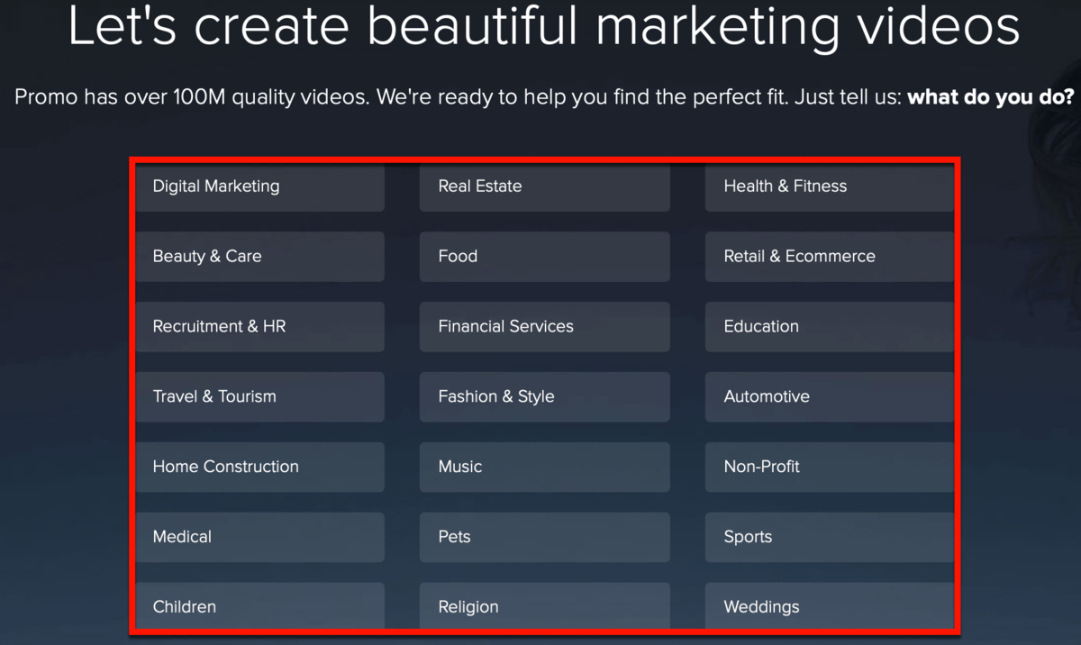
Here are the Promo templates you can use in the blogging industry:

Promo’s idea of templates is to help those who never touched a video editing tool in their life.
After picking a template, all that’s left to do is plug in your marketing messages and edit your timeline.
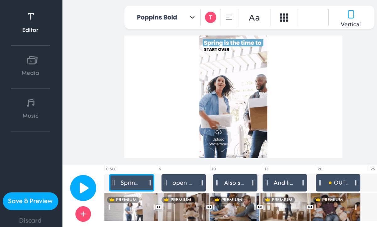
Each template comes with text fields you can edit with your message to your audience.
Simply double-click the text field you want to edit and type away.
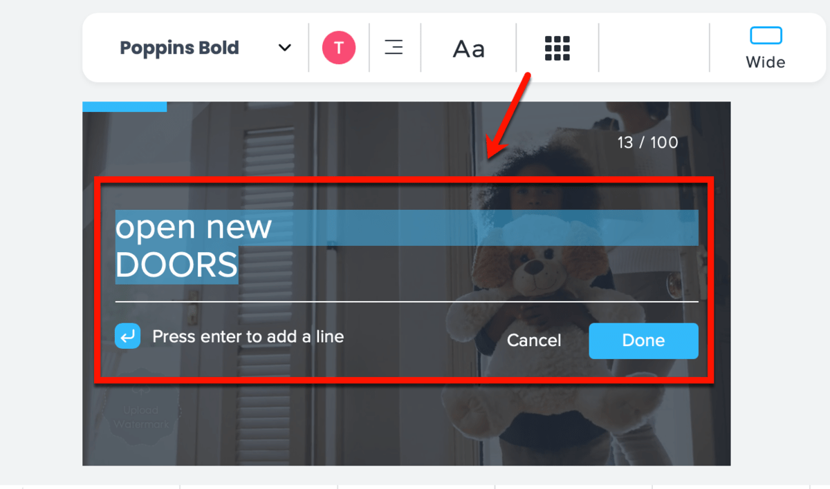
Feel free to edit each text section’s font, alignment, style, color, and position.
Not happy with the animation?
Promo features dozens of ready-made animation styles to help make text pop.
A preview of each animation plays upon application to help you make the perfect choice.
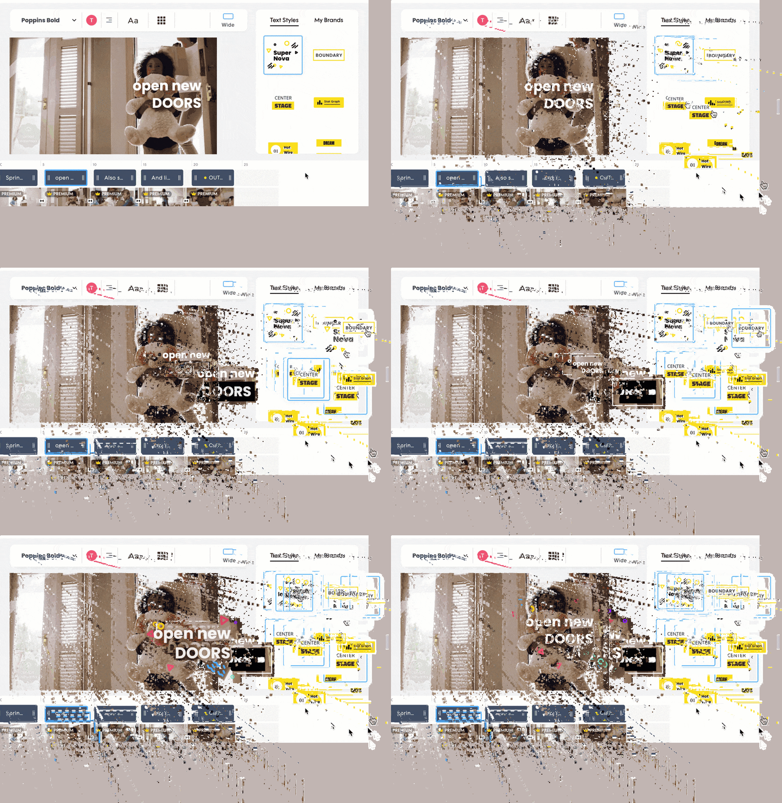
Of course, you can also use Promo to create unique videos from the ground up.
If you have no video footage to use, Promo has a library of stock assets you can use. Otherwise, you can upload your own videos, arrange them in your timeline, and add in your message.
10. Slideshow presentations
Incorporating video content in your strategy can be intimidating, especially for new bloggers.
It is a huge leap that will definitely elevate your brand’s online presence, but you can save it for later.
Just focus on creating visualizations and infographics for now. Eventually, you’ll have a stockpile of infographics and data visualizations in your WordPress library.
There are two things I’d do with that.
First, I’ll make sure to set up a proper Pinterest account for my blog. This will allow me to squeeze evergreen value out of my collection of visual content.
Second, I’ll take my most comprehensive infographics, crop out the most important sections, and repurpose them to create slideshows.
You can use them to create your own webinars or promote them on websites like SlideShare.
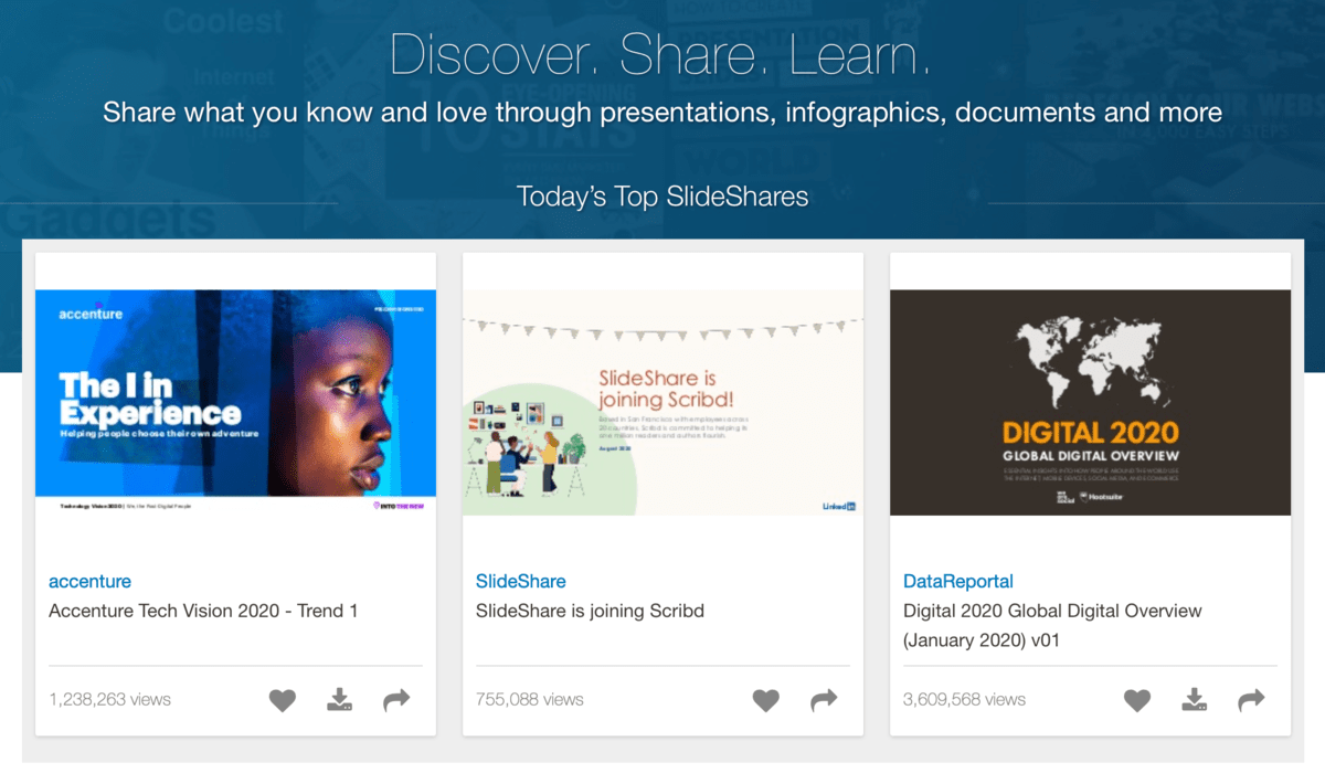
How to create slideshow presentations
You don’t need a sophisticated visual content creator to chop up infographics and visualizations into reusable parts.
Basic tools like MS Paint allow you to crop specific areas of any image with ease. Naturally, you can also use a screenshot tool like Snagit to manually extract parts of an existing visual.
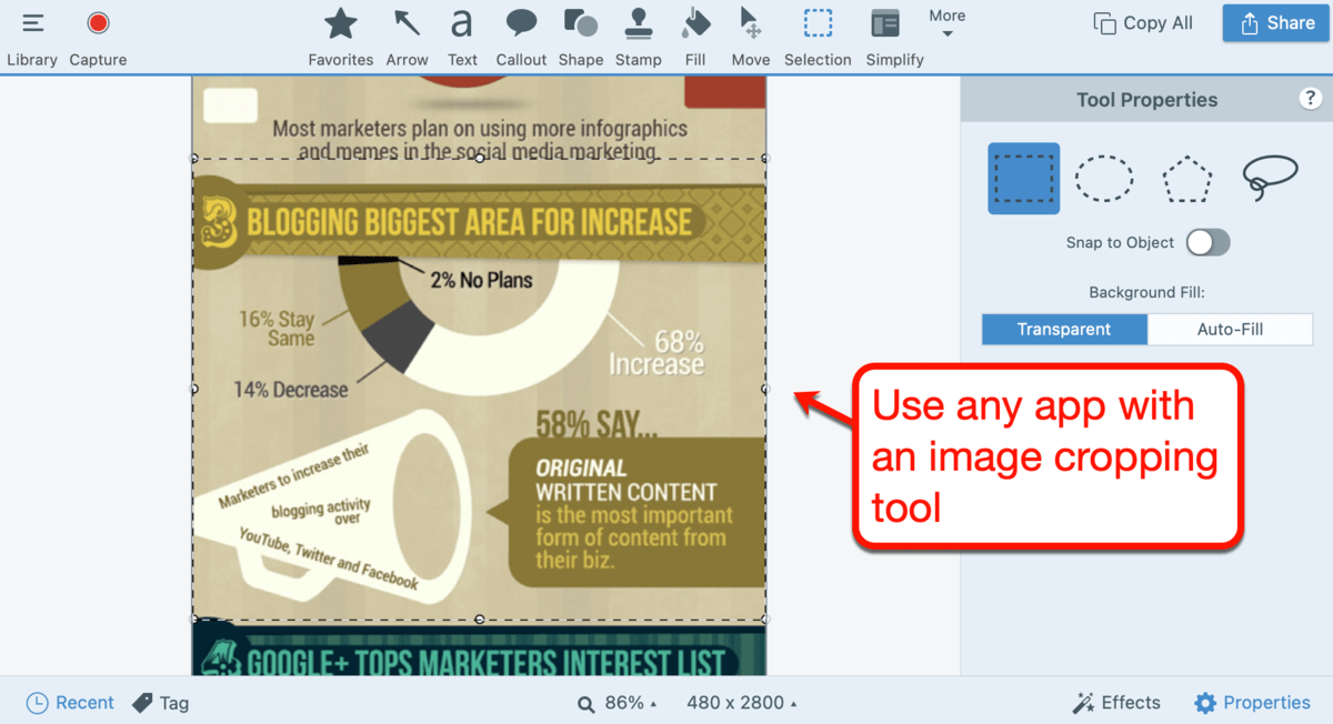
The real challenge lies in composing the actual slideshow.
Here are the best tips I can gather from the web:
- Let visuals do the talking – Don’t clutter slides with thick walls of text. Instead, use data visualizations to condense in-depth information into a more digestible form.
- Link to more comprehensive resources – You don’t want to overload a slide with text, but you also need to compel viewers to act. To accomplish both, link to more comprehensive resources – preferably from your website – below the slides or in the slideshow’s notes.
- Use templates – If it’s your first time creating a presentation, don’t be afraid to use templates. Slideshow apps like PowerPoint have plenty of professional templates that will instantly give direction to your design process.
- Promote your slideshow everywhere – After uploading your slideshow on SlideShare or your own blog, share it on websites like LinkedIn and Pinterest. Look for communities who care about well-done visuals, your topic, and the data included in your presentation.
- Learn your topic from the inside and out – When using a slideshow for a webinar or speaking event, make sure you do tons of research. You need to be able to make valid and insightful points without looking at the current slide.
Conclusion
Going full throttle with a visual content strategy for your blog will take your authority to a whole new level.
You just need to know what visuals to use, how to design them, and where to promote them.
The ideas and tools above should be more than enough to help you build a solid visual content strategy. Whatever you do, be sure to instill your own brand’s voice and style into every image you create.
If you have more questions about the topic, don’t hesitate to ask me in the comments below. I’m also looking forward to your feedback and suggestions.
You Might Also Like:
- 30 Ways to Grow Your Blog Quickly Like a Boss
- How to Measure and Improve User Experience on Your Blog
- My All-time Favorite Blogging Resources (Tools & Trainings)

from Master Blogging https://ift.tt/3wZABu3
